How to Match Wood Stains: A Craftsman’s Guide
You bring home a new dining chair, sideboard, or bookcase. In the store, the finish looked close enough. Then it lands beside the piece that's been in your family for years, and suddenly the difference is obvious. One reads too red, the other too flat. Under the kitchen lights they almost agree. By morning sunlight, they don't.
That's the moment DIYers learn that matching wood stains isn't about picking “brown.” It's about reading wood the way a craftsman reads grain, porosity, light, and finish build. Around Ann Arbor and across Southeast Michigan, I've seen this same question come up for decades: how do you make a new piece live comfortably beside an older one without making the room feel patched together?
At Tyner's, that kind of decision has always been treated with respect. Since 1957, families have come to us with high-consideration furniture questions because good furniture isn't an impulse buy. It's part of how a home settles in over time, a point explored in this look at why furniture purchases are high-consideration decisions. A well-matched stain doesn't just make a room prettier. It protects the value of an heirloom, supports a cohesive interior design plan, and helps a made-to-order piece feel like it belongs from day one.
Table of Contents
- The Challenge and Charm of Matching Wood Tones
- Decoding Your Wood's Unique Signature
- The Art of the Test A Craftsman's Method
- Applying Stain for a Seamless Finish
- Troubleshooting Common Matching Pitfalls
- When to Partner with a Finishing Expert
The Challenge and Charm of Matching Wood Tones
You set a new sideboard beside your parents' old dining table, and the difference jumps out before you even sit down. One piece reads warm and mellow. The other looks redder, darker, or a touch flat under the same light. That moment is where stain matching becomes real. It is also where many people learn that wood color is never just color.
A good match takes judgment as much as technique. Stain sits on a living material with its own habits, and solid wood rarely responds in a perfectly uniform way. Two pieces can be close in tone and still feel wrong together if the grain reflects light differently or the finish builds a different depth. That is the challenge. It is also the charm.
After forty years around dining tables, bedroom suites, and custom case pieces, I can say this with confidence. Wood has a personality. Cherry gains warmth with age. Oak throws light off its open grain. Maple can look quiet one minute and stubborn the next. If you ignore that personality and chase color alone, the result often looks forced.
Matching and coordinating call for different decisions
Homeowners often bring in a drawer front, a floor sample, or a phone photo and ask for an exact duplicate. Sometimes that is the right goal. If you are adding one cabinet door to an existing built-in, close accuracy matters. If you are furnishing a room with several wood pieces, the smarter target is often coordination that feels intentional from across the room and natural up close.
A true match is supposed to disappear. Coordination is supposed to belong.
That difference matters because wood furniture is viewed in context, not in isolation. A dining table has to live with flooring, trim, wall color, window light, and the finish sheen on nearby pieces. I often tell customers to judge the room first and the sample second. On a smaller accent table, a near match may be more than enough. On a large bed, trestle table, or heirloom sideboard, small misses become obvious every day.
Why the work gets more demanding on better furniture
Quality furniture shows more of the wood, and that raises the standard for stain matching. Veneer and heavily controlled factory finishes can hide some variation. Hand-crafted solid wood does the opposite. It reveals figure, grain movement, pore structure, and the small shifts that make a piece feel genuine.
That is part of why high-consideration furniture purchases deserve a slower, more careful decision. The finish is not decoration added at the end. It shapes how the piece will read for years in morning light, lamplight, and everything in between.
At Tyner's on South State St. in Ann Arbor, we see this often with made-to-order Canadel finishes and Amish hand-crafted furniture in oak, cherry, and maple. Customers are not only asking, “Does this sample look right today?” They are asking whether the piece will still feel honest and settled in the room after the seasons change and the wood matures.
Preparation plays a part too. Surface prep, sanding discipline, and finish choice all affect how color lands, which is why even a basic prep reference like the Neasden Hardware guide to wood finishing reminds people that the surface underneath drives the final result.
Good stain matching asks for respect. Respect for the species, respect for the room, and respect for the value of the piece in front of you. On everyday projects, that mindset helps you make better choices. On heirloom-quality furniture, it is often the line between a finish that feels rich and one that feels expensive but wrong.
Decoding Your Wood's Unique Signature
A neighbor will sometimes bring me a drawer front and a stain card and ask why the colors do not line up. The answer is usually sitting in the wood, not on the label. A stain name gives you a starting point. Species, grain structure, age, and the finish already on the piece tell you what color is possible.
Start with species, not stain cards
The first question is simple. What wood am I dealing with?
Oak, maple, cherry, pine, and poplar may sit close together in a showroom, but they do not behave alike under stain. Red oak usually accepts pigment in a readable, honest way because its grain is open. Maple is tighter and can look pale one minute and muddy the next if the color is forced. Pine and poplar need more caution because they often absorb unevenly and show blotching if the surface is not prepared properly.
That difference matters more than beginners expect. A dark stain on oak often settles into the pore pattern and gives the board depth. The same color on maple can sit flatter and colder. On pine, it can grab hard in one patch and stay weak in the next.
Use your eyes first, then your hand.
- Open-grain woods: Oak usually shows visible pores and stronger grain lines. Pigment tends to read clearly.
- Tight-grain woods: Maple feels smoother and looks more uniform, but it can resist color or take it unevenly if over-sanded.
- Softwoods and temperamental hardwoods: Pine and poplar often need extra restraint. If you rush them, they advertise every mistake.
Even within one species, boards can shift in color and character because of how the tree grew and where that board was cut from the log. One oak panel may read warm and tan. Another may carry a pink cast. That is one reason matching a treasured piece takes judgment, not just the right can off the shelf.
If you want a stronger grounding in species before you choose color, this guide to choosing the right hardwood for longevity and style helps explain why some woods age gracefully under stain and others ask for a lighter hand.
Read the surface before you touch the color
Raw wood has one personality. Finished wood has another.
A craftsman checks whether the surface is glossy, dry, waxy, sun-faded, smoke-darkened, or amber from an older topcoat. Those details change what your eye reads as “the stain color.” Many mismatches come from chasing the wrong layer. The stain may be close already, while the actual difference is in the varnish, shellac, or years of oxidation.
Here is the checklist I use at the bench:
| What you observe | What it usually means |
|---|---|
| Deep open pores | Likely an open-grain species that will show pigment distinctly |
| Smooth, fine face | Likely tighter grain, which may require more patience in testing |
| Uneven dark patches | Prior stain absorbed differently, or the wood was not prepped evenly |
| Amber cast | Age, topcoat, or light exposure may be influencing the apparent color |
A stain match is stain, wood, topcoat, and time working together.
That is why prep cannot be treated as separate from color. Sanding scratches, leftover finish, glue residue, and dust all change absorption. The Neasden Hardware guide to wood finishing is a useful refresher on that point, especially if you have not done this kind of surface work in a while.
At Tyner's, we see this constantly on solid wood dining sets, bedroom pieces, and Amish hand-crafted furniture. The grain is part of the design, and a good match respects that instead of trying to bury it. On an everyday project, careful reading of the wood saves time and frustration. On an heirloom piece, it can be the difference between a finish that feels settled and one that looks slightly off every time the light hits it.
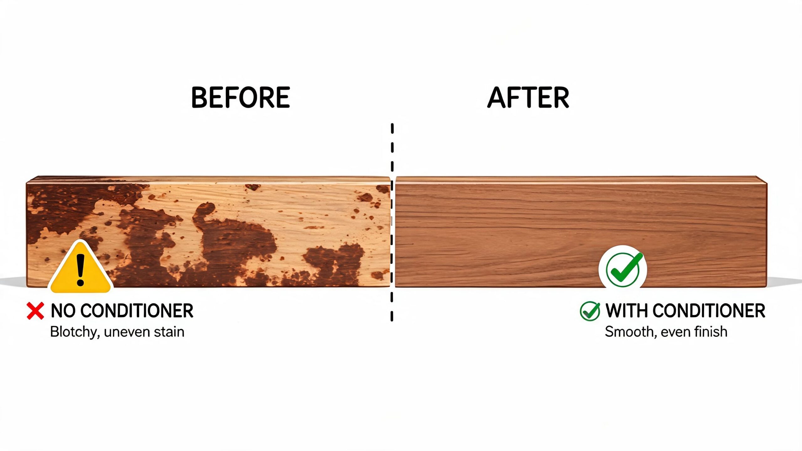
The Art of the Test A Craftsman's Method
A neighbor will often bring me a drawer front and a stain can and ask why the color still looks wrong. The answer usually shows up on the test board, not on the finished piece. Good stain matching is a controlled trial. On heirloom-quality wood, that discipline protects you from expensive guesswork.
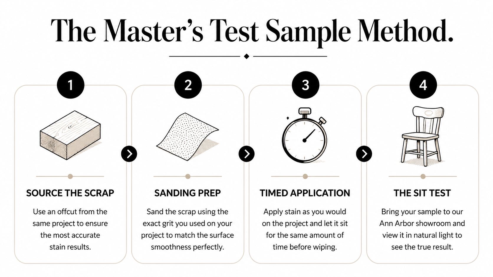
Use the right scrap and the right sanding sequence
A useful test starts with wood that behaves like the actual piece. Offcuts from the project are best. If that is not possible, get the same species, cut, and grade. A red oak sample will not teach you much about maple, and a flat-sawn board will not reflect a quarter-sawn panel the way you need it to.
The preparation must also be consistent. In a practical stain-matching demonstration on test discipline and sample prep, the finisher works through progressive sanding, stops in the 120 to 150 grit range, and compares only after the samples have dried fully in order to judge color accurately under consistent conditions (video reference).
My shop routine is simple:
- Find a true sample piece. The closer it is to the actual part, the more your test will tell you.
- Prep it the same way. Strip old finish if needed, sand in sequence, and stop at the grit you plan to use on the piece itself.
- Clean it thoroughly. Fine dust changes how stain sits and dries.
- Make enough samples. One board is not testing. It is hoping.
Label every sample. Write down the stain, any mix ratio, how long it sat before wipe-off, and what topcoat you plan to use. Memory is unreliable after the third or fourth board.
Treat every test like a recipe
Stain matching rewards record-keeping. A small change in dilution, soak time, or wipe pressure can shift the result enough to show across a tabletop or cabinet face. That is why experienced finishers work in measured steps instead of adjusting by feel alone.
A strong test set usually includes:
- A straight sample from the can with your normal wipe-off timing
- A mixed sample if you are blending colors to chase warmth, depth, or age
- A lighter application sample for woods that go dark fast
- A topcoated sample because raw stain almost never looks the way the finished piece will look
Here is the part many DIYers skip. View the samples where the furniture will live, not only under shop lights. Morning light, warm lamps, and overhead LEDs can each push the same stain in a different direction. On cabinets and built-ins, the finish guidance from Wheeler Painting & Restoration Services is a helpful companion if your project includes large visible runs that need to read as one color.
Shop note: Never choose a stain formula from a wet sample or a bare sample. Let it dry, topcoat it, then judge it.
A craftsman's mindset matters in this process. The goal is not to force every board into one flat color. The goal is to bring the wood into the same family of tone while respecting its grain, age, and character. On a valuable dining table, dresser, or cabinet, that judgment matters as much as the stain itself. If you are comparing visible case pieces, this guide to what to look for when buying chests, dressers, and cabinets shows the exact areas where a weak match stands out first.
Patience earns the match. Haste usually leaves a finish that is close on paper and wrong in the room.
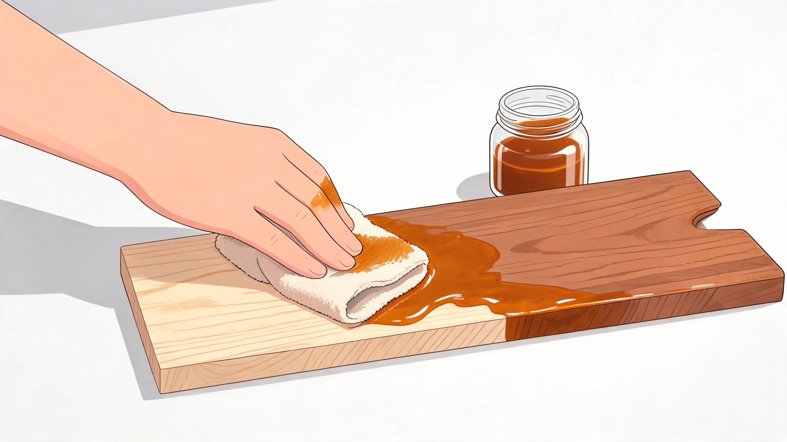
Applying Stain for a Seamless Finish
Once the test board earns your trust, the actual work begins. Many people tend to get overconfident at this stage. They did the hard part, found the right formula, and then rush the application. That's a little like a chef dialing in the sauce, then scorching it at service.
Control the room before you open the can
For heirloom-quality results, the wood and the room both need to be in range. Verified guidance recommends wood moisture below 19%, surface temperature between 50-80°F, and in humid climates such as Southeast Michigan, acclimating wood for 7-10 days. With those controls, finish systems can hold a 95% match retention after 5 years, according to this surface-preparation and environmental-control reference.
In plain terms, don't stain cold wood, damp wood, or wood that just came out of a truck and hasn't settled into the room.
That matters in this part of Michigan. A dry winter house and a humid summer workshop don't treat stain the same way. If you're working on cabinets, trim, or built-ins, the detailed cabinet-focused advice from Wheeler Painting & Restoration Services is a helpful supplement because it reinforces steady application habits on vertical and highly visible surfaces.
Application is where discipline shows
A good application has rhythm. Wet edge. Even pressure. Consistent wipe. No panic.
Here's the standard I recommend:
- Load generously but sensibly. Starving the surface can create uneven color.
- Wipe consistently. If one area sits longer than another, it can go darker.
- Follow the grain. Especially on oak and cherry, your hand movement shows.
- Match the full schedule. If the test sample got one topcoat, the project gets one topcoat before final judgment.
Some woods forgive a craftsman. Red oak often does. A hard maple cabinet door won't be as generous. A solid cherry tabletop can deepen beautifully, but only if the whole face is handled evenly.
A short decision guide helps:
| Situation | Better approach |
|---|---|
| Large tabletop | Work in controlled sections and keep your wipe timing uniform |
| Cabinet doors | Lay them flat when possible for better control |
| Blotch-prone wood | Use conditioner if the species calls for it |
| Existing room match | Carry the sample into the room before approving the result |
The hand applying the stain matters just as much as the formula in the cup.
On valuable pieces, this is one place where a local option can simplify the process. Tyner Furniture provides stain matching support that lets customers compare wood species and finish samples side by side with existing woodwork, which is useful when a new dining, bedroom, or home office piece needs to coordinate rather than merely “look similar.”
And this matters beyond dining. The same thinking applies whether you're choosing a solid wood sideboard, a home office bookcase, or outdoor-adjacent case goods visible from inside the home. Across all of it, finish consistency is part of durability. It protects the investment, not just the appearance.
Troubleshooting Common Matching Pitfalls
Even careful work can go sideways. The key is knowing whether the problem comes from the room, the stain, or the wood.
When the color looks wrong in the room
Lighting fools people every day. The same stain can appear as three different colors under natural sunlight, incandescent bulbs, and fluorescent tubes. That's why professionals recommend testing in the final location, as explained in this wood stain matching article focused on lighting, batch variation, and aging.
If the sample looked right in the shop but wrong in the dining room, that doesn't automatically mean the formula failed. It may mean the room is finally telling the truth.
Common signs and responses:
- Looks greener or flatter at night: Check the lamp type before changing the stain.
- Looks too warm by the window: Daylight may be pulling out undertones that were hidden indoors.
- Matches new wood but not the old piece: Age and ultraviolet exposure may have shifted the older finish over time.
Production batches can also vary slightly, which is why mixing cans before use is a smart precaution on larger projects.
When the wood itself fights the match
Some failures are not color failures. They're absorption failures.
If you see blotches, striping, or patches that read too dark, ask these questions:
| Symptom | Likely cause | Best response |
|---|---|---|
| Dark random patches | Uneven absorption on soft or variable wood | Re-test prep method and consider conditioner where appropriate |
| Color lighter than sample | Wipe timing, environment, or incomplete process match | Repeat the full sample schedule exactly |
| New piece still won't blend with older one | Natural aging and UV shift in old finish | Aim for coordination instead of a forced exact match |
Sometimes the honest answer is that the old finish has changed so much over time that a perfect duplicate isn't realistic.
That's especially true when ordering furniture online from photos and hoping color will land exactly right in your home. If that's your situation, this guide on how to avoid color mismatch when ordering online can save a lot of second-guessing before you commit.
One more design note. If you intentionally mix wood tones in one room, the verified guidance recommends staying at no more than three different stains so the space keeps visual coherence, and focusing on undertones and grain pattern as the main coordination tools, as noted in the linked Minwax reference above.
When to Partner with a Finishing Expert
There's no shame in handing a stain match to someone who does this with practiced hands. In fact, on the right project, that's the more disciplined choice.
Some projects deserve a lower-risk path
If you're matching a family heirloom, a new Amish hand-crafted dining table, or a bespoke Canadel configuration with a finish chosen to echo existing woodwork, the cost of a miss is high. Not only in money, but in the feeling of the room. Once a stain goes wrong on solid wood, the fix can become longer, messier, and more expensive than getting proper guidance at the start.
That's also true when the piece has visual importance. A small accent table can tolerate some variation. A dining set cannot. Neither can a prominent bedroom collection, a statement bookcase in the home office, or a centerpiece cabinet viewed from multiple angles every day.
What professional help actually changes
An experienced finisher reduces guesswork in four ways:
- Species judgment: They know what the wood is likely to do before color goes on.
- Sample discipline: They test on matched material, not wishful substitutes.
- Topcoat awareness: They judge the whole finish system, not just the stain.
- Design perspective: They know when exact matching will look stiff and when coordination will look more natural.
That perspective matters in a real home. Not a showroom vignette, not a phone screen, and not under generic retail lighting. In a lived-in Ann Arbor home, you're dealing with daylight from one side, warm lamps at night, existing rugs, wall color, metal finishes, and the simple fact that old wood carries history.
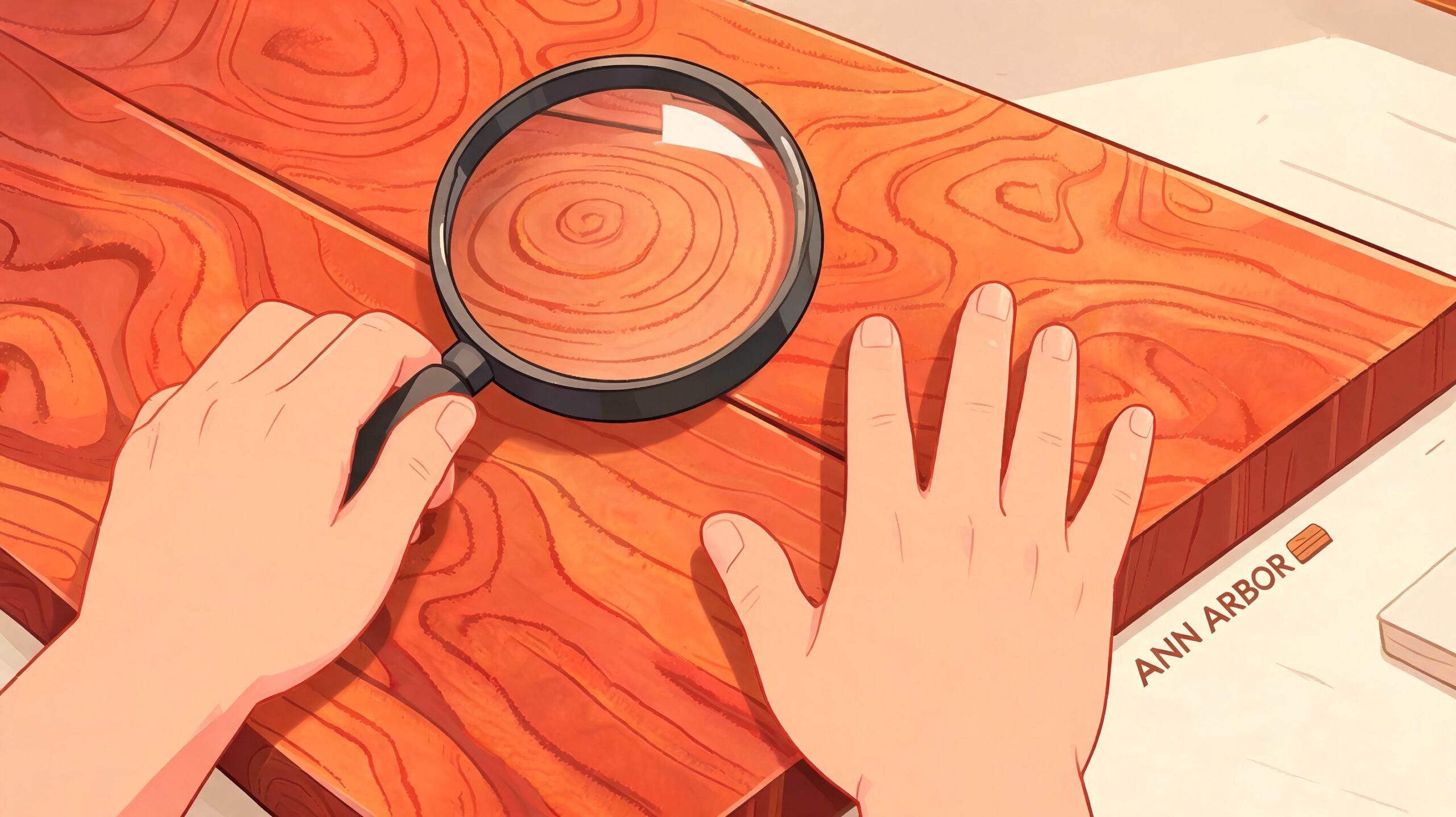
A seasoned furniture craftsman respects that. So does a good retailer. Since 1957, Tyner has served Southeast Michigan with that longer view. The showroom on South State St. isn't only for living room seating, though you should absolutely do a proper sit test when comfort matters, especially with ergonomic options like Stressless. It's also a place where finish decisions can be handled with the seriousness they deserve, whether you're furnishing a dining room, bedroom, home office, or even planning connected looks that carry through to outdoor-adjacent spaces. In-stock is just the beginning. Made-to-order options, including customizable finishes, fabrics, and configurations, are often the better fit when the room already has a strong point of view.
High-value furniture should earn its keep over years, not months. That's why stain matching belongs in the same conversation as joinery, material integrity, durability, and cost per year. A hand-crafted solid wood piece with the right finish can become part of the house in a way mass-market furniture rarely does.
If you'd like help comparing finishes in person, visit Tyner Furniture in Ann Arbor for a sit test, a closer look at hand-crafted solid wood options, or guidance on custom orders from brands like Canadel and Stressless. You can also browse the online Quick Specs for special-order details, and if you're planning a larger purchase, ask about Special Financing and the Low Price Promise.